Cloud Dancer: A Color for 2026
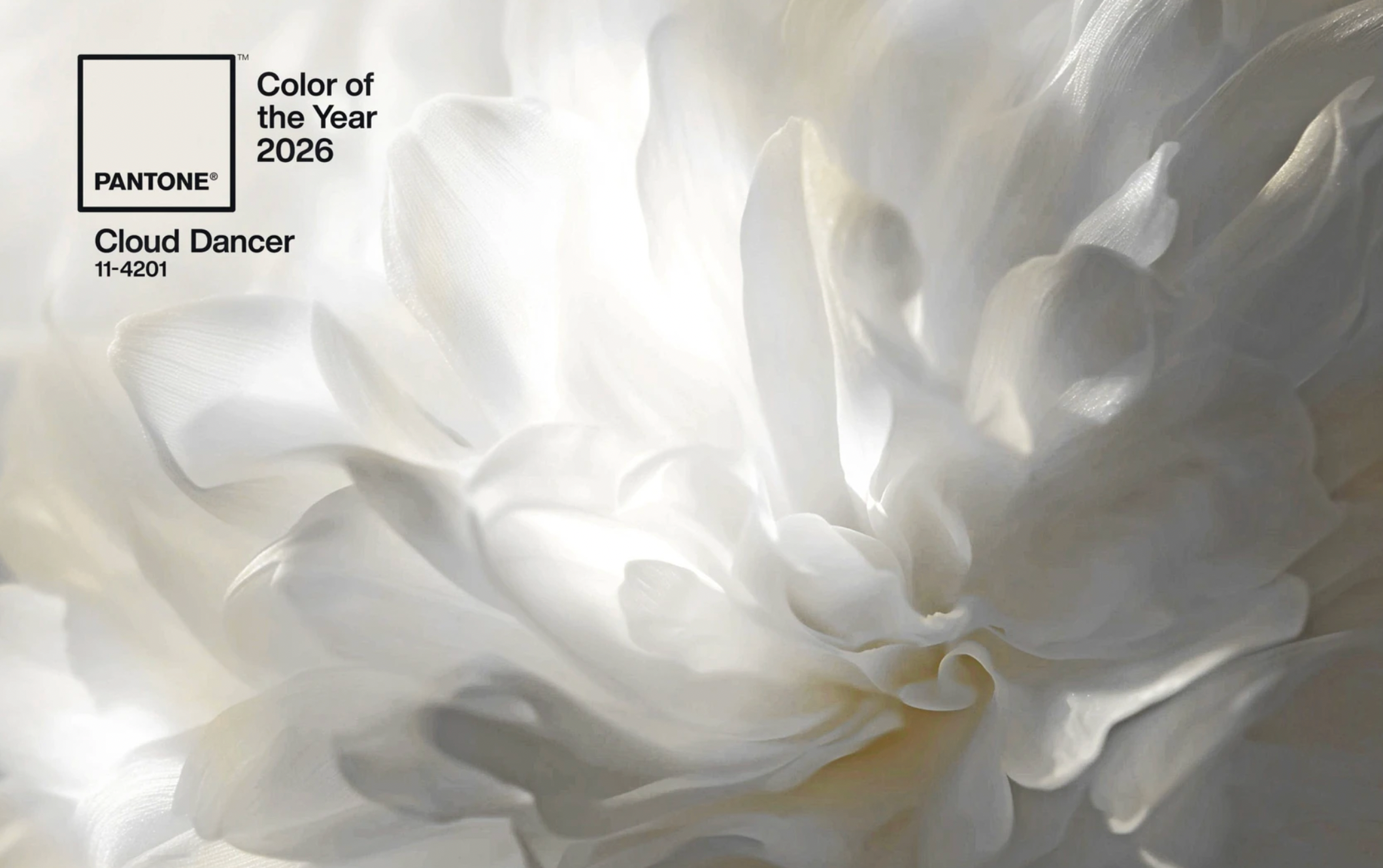
Photo: Pantone Color Institute.
When Pantone named Cloud Dancer the Color of the Year for 2026, I was pleasantly surprised. Few past selections have grabbed me the way this one did. I loved the name instantly — airy, playful, a dancer skipping from cloud to cloud across the sky. In a world flooded with political tension, constant noise, and visual extremes, the image felt light, positive, yes almost melodic. The name itself summons movement. I see a dancer stepping across the sky, one foot in the air, tracing invisible lines across an open field of light, chasing clouds— in an atmosphere of aesthetics!
Most people will glance at it and call it white. That’s lazy seeing. It is not “white.” It is a broken, tuned white, layered with traces of warmth, light diffused like noon sun through high clouds, carrying a subtle momentum that travels through the day. Those who pause, who notice the slight variation in tone will recognise it’s porcelain surfaces picking up a silvery gleam. Linen reads warmer, almost buttery; stone reveals hidden mineral undertones; silk carries a trace of light along folds. Against walnut or oak, it softens the wood; against brushed steel, it refracts rather than reflects; alongside concrete, it accentuates texture without declaring itself. It behaves like a choreographer of its surroundings, orchestrating movement, proportion, and light rather than filling space.
Pantone positions Cloud Dancer not as decoration but as calibration. According to the Pantone Color Institute, the selection reflects a need for balance and adaptability in a world overloaded with extremes. The institute describes the shade as inviting openness, clarity, and compositional grounding — a response to years of saturated palettes and visual intensity that have dominated fashion and interiors alike (People, Dec 2025). What’s striking is how quickly designers have picked up on this: architects, stylists, and creatives are already deploying the tone to frame material.
Interior architects are using it as a structural canvas that lets material, texture, and natural light emerge in dialogue. In residential design, spaces dressed in this hue make material behaviour legible — plaster’s irregularities become visible, wood grain becomes expressive, stone layers articulate subtle tonal shifts. In hospitality design, studios such as Studio MK27 and Formafantasma integrate similar nuanced whites in projects that prioritize material resonance and spatial poise, allowing surfaces to register with intentional gradation instead of flattening into uniformity. This approach appears across high‑end residential projects and gallery spaces where the emphasis is on atmosphere that feels composed rather than staged.
Artworks also find a stage as galleries are showing more calibrated whites in wall palettes to allow contemporary work — often rich in pigment and texture — to read as discrete elements rather than part of a total field. These applications appear in critical design coverage following the Pantone announcement, where writers note that “layered neutrals and mineral tones” are emerging as a major trend across installations and curated spaces (Design Viewpoint, early 2026 commentary).
Its minimalism is deceptive. It is neither empty nor inert. Cloud Dancer shapes perception, orchestrates light, and mediates extremes, proving that sophistication is not loud but relational, demanding engagement without demanding attention. In interiors, a wall in this shade can unify multiple textures, from raw plaster to brushed metal. In product design, it highlights form without posturing. In textiles, it reveals gradient across silk, linen, or wool, drawing out the inherent qualities of the material. In architecture, it allows daylight to animate spaces without glare, providing a kind of structured luminosity that responds to the sun rather than imposing upon it.
Cloud Dancer is my favorite color — minimalistic yet dynamic, restrained yet energetic. It carries a trace of optimism without sentimentality, a sense of openness without indecision. It hums with potential in every material encounter, from interior surfaces to fashion silhouettes, from natural light to reflective metals.
In 2026, it reminds us that colour can do more than decorate: it can mediate, elevate, and compose. It offers a way to navigate extremes, a way to frame space and object with intelligence and vitality — not by shouting, but by enabling what’s already there to register fully. Every surface, every fold, every reflection hums with intelligence because the colour allows material and form to speak first. Get inspired and listen to the Cloud Dancer’s Playlist here, while you dance from one fluffy cloud to the another!